The masthead is placed at the top of
the page to make it clear for the audience to see what the tile of
this magazine. The masthead is partly covered by the icon but is still easy to
see what the magazine is called. The font that is used for the masthead is
large and bold, showing the audience that the producer is very
confident in this brand. The colour that is used in the masthead is
white which makes it very noticeable for the audience to see as the
background of this magazine is black.
The skyline is placed in the
usual position, above the masthead, in very small font as it is not as
important as the rest of the magazine. The use of using a skyline gives the
audience more of a professional view of the magazine.
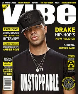
The colour scheme that this
magazine uses is white, black and bright yellow. The use of this colour scheme
makes the magazine looks more professional as it uses a limited range of
colours. Using a limited range of colours makes the whole magazine work
effectively as the colours goes well with one another, making each of the
colours stand out, drawing the audience into the magazine.
The sell lines use
a couple of different sized fonts. Most of the sell line
uses the same colour combination scheme as first word or line is
either coloured or highlighted in yellow then the second word or line coloured
in white, then repeated again. Using a colour combination scheme makes the
magazine more attractive to the audience, as each sell line seems to
stand out more as it would do if the sell lines was coloured in
one colour, this helps to draw the audience in wanting to read the magazine.
The main image is a medium camera
shot of the icon. As the magazine as used one image makes it easy to realise
what the main articles in the magazine will be about the singer Drake. The
image also combines into the colour scheme as the writing on his shirt is in
bold capital letters like the masthead.
The cover contains the typical
codes in which many magazines holds. This includes the bar code that is placed
at the bottom of the page, vertically and suitable sized, on the left hand
side of the cover, which gives the audience additional information such as
the price and the issue release date. Also where the bar code is
placed above it has the website for the 'VIBE' company.
Over
all the layout of this magazine is quite formal as all the sell lines are
placed in line beneath each other. The layout is rather busy as the front cover
uses some different sized fonts, and a maximum numbers of sell lines. The
front cover has quite a lot of featuring as both sides of the magazine are
filled with sell lines but don't use a verity of colours
No comments:
Post a Comment