Friday, 16 November 2012

Music Magazine Cover Analysis 2


The front cover contains all the typical codes in which all magazines holds. This includes the masthead, the sell lines and the date it’s been issued and price, however we cannot see the bar code has its been cut out of the bottom right of the page.

The masthead is placed at the top of the page to make it clear for the audience to see what the tile of this magazine. The masthead is partly over the main image. The colour that is used in the masthead is bright red which makes it eye catching for the audience but also making the magazine itself stand out to.

The skyline is placed in the usual position which gives the audience a professional view of the magazine.

The main colour scheme is white and red. The use of only using two colours, gives the magazine a professional look which attracts the audience. The cover is successful in using a limited range of bold colours.

The sell lines are in different sized fonts but mainly small and is either in lower case or capital case. The sell lines are placed on the right hand side of the page. The main sell line is placed at the bottom of the page. It is the biggest sized you can see on the cover, making it noticeable and clear for the audience to see that this magazine main article will be about Adele. 

The main image makes the magazine obvious as the icon fills all most the whole page. As the magazine only uses one image it makes it obvious for the audience to realise that the main articles in the magazine will be based on Adele before even looking what the sell lines says.

Over the entire layout is quite formal as the sell lines are placed in line beneath each other. The layout is not busy as it the cover only contains one main image and doesn't contain loads of font colours or sizes. The front cover has a minimal of featuring that includes a few sell lines and colours.


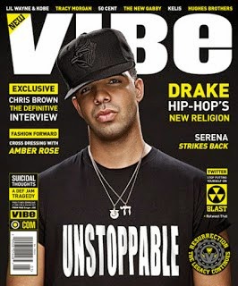
Music Magazine Cover Analysis 3


The masthead is placed at the top of the page to make it clear for the audience to see what the tile of this magazine. The masthead is partly covered by the icon but is still easy to see what the magazine is called. The font that is used for the masthead is large and bold, showing the audience that the producer is very confident in this brand. The colour that is used in the masthead is white which makes it very noticeable for the audience to see as the background of this magazine is black.

The skyline is placed in the usual position, above the masthead, in very small font as it is not as important as the rest of the magazine. The use of using a skyline gives the audience more of a professional view of the magazine.

The colour scheme that this magazine uses is white, black and bright yellow. The use of this colour scheme makes the magazine looks more professional as it uses a limited range of colours. Using a limited range of colours makes the whole magazine work effectively as the colours goes well with one another, making each of the colours stand out, drawing the audience into the magazine.

The sell lines use a couple of different sized fonts. Most of the sell line uses the same colour combination scheme as first word or line is either coloured or highlighted in yellow then the second word or line coloured in white, then repeated again. Using a colour combination scheme makes the magazine more attractive to the audience, as each sell line seems to stand out more as it would do if the sell lines was coloured in one colour, this helps to draw the audience in wanting to read the magazine. 

The main image is a medium camera shot of the icon. As the magazine as used one image makes it easy to realise what the main articles in the magazine will be about the singer Drake. The image also combines into the colour scheme as the writing on his shirt is in bold capital letters like the masthead.

The cover contains the typical codes in which many magazines holds. This includes the bar code that is placed at the bottom of the page, vertically and suitable sized, on the left hand side of the cover, which gives the audience additional information such as the price and the issue release date. Also where the bar code is placed above it has the website for the 'VIBE' company.
Over all the layout of this magazine is quite formal as all the sell lines are placed in line beneath each other. The layout is rather busy as the front cover uses some different sized fonts, and a maximum numbers of sell lines. The front cover has quite a lot of featuring as both sides of the magazine are filled with sell lines but don't use a verity of colours

Tuesday, 13 November 2012

Collge Magazine Mock Up Evaluation.


How does your media product represent particular social groups? 
My media product represent a particular social groups by using a pacific model around the same age as my target audience for the main image, this means the audience can relate to her and the magazine because they are more likely to buy it as it has day to day information that could be a suitable guide for them. The masthead 'College' is very relatable with the target audience as they are teenagers that are either moving up to college or already attends college.

What kind of media institution might distribute your media product and why?
 If I was to choose a company to print and distribute my magazine it would be a company called IPC this is because they print and distributes magazines to stores across the country. Also it is the leading magazine publisher in the UK. this shows that it will help the magazine become more successful.

Who would the audience be for your media product?
The target audience for my media product is mainly for college students between the ages of 16 and 18 but also for students who are in the years below that are interested in moving up to college. My magazine is also aimed at parents of the primary target audience as they want to know what the college is like and whether it is the right place for their children to attend and achieve their best.

How did you attract/address your audience?
 I attracted my audience by using a variety of different techniques and codes of a typical magazine; the reason for this is because it creates a familiarity and encouragement for the audience to buy it. The fronts that I have used are bold and clear. The image that I have used for the front cover is around about the same age as the target audience, therefore the audience will be able to relate to her and more likely want to buy the magazine. Over all the magazine is attractive and addresses to the target audience by using sell lines, this is because it could relate to the things that the students want to know or find out more about, therefore they will want to read the articles inside.

What have you learnt about technologies from the process of constructing this product?
I have learnt several techniques in the process of making my magazine. From the program I used to make the cover I used, pixlr express. I have learned to make the image more appealing.